Common Tongue Squarespace Template Review: Is It Right for Your Business?
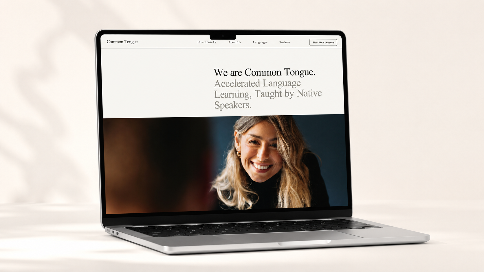
If your business needs more than a beautiful homepage—if people need to understand your method, meet your team, read proof, and choose a package—Common Tongue gives you an unusually complete starting point.
Squarespace presents the demo as a language-learning business, but the structure is useful far beyond language instruction. It is especially strong for tutors, coaches, consultants, educators, and other experts selling a clear transformation through lessons, sessions, or packages.
I reviewed the live Common Tongue Squarespace demo section by section. Here is what works, what requires more effort, and who should actually choose it.
The quick verdict
Common Tongue is best for a service business that has a defined method and enough substance to support a longer website. It feels professional and editorial without becoming cold or corporate. The design gives you space to explain how your work works, introduce multiple team members, display detailed testimonials, and sell structured offers.
It is not the best choice for someone who wants to launch with three sentences, one photo, and a contact form. This template rewards strong copy, good photography, and a business model that can be organized into clear steps.
CategoryCommon Tongue assessmentBest forTutors, language instructors, coaches, education businesses, consultants, small expert teamsPrimary goalHelp visitors understand the method, trust the provider, and book or purchaseVisual styleEditorial, minimal, sophisticated, service-ledContent levelMedium to highStrongest featureA complete long-form sales journey with services, team, proof, and packagesMain considerationThe page can feel long or repetitive unless the copy is edited carefully
Who Common Tongue is best for
Choose Common Tongue if your visitors typically need education before they are ready to buy. That makes it a strong fit for:
Private tutors and tutoring collectives
Language teachers and language schools
Academic coaches and education consultants
Career, leadership, or executive coaches
Business consultants with a signature process
Music teachers and creative instructors
Small agencies or studios with several specialists
Service businesses selling session bundles or packages
The template is particularly useful when your business has multiple instructors, languages, specialties, or levels of service. Its structure makes it easy to communicate both the larger brand promise and the individual expertise behind it.
What the Common Tongue demo includes
The demo is built primarily as a long, guided homepage with anchor-style navigation. Its main sections include:
A strong positioning statement and primary call to action
A three-part explanation of the teaching method
An About section with a multi-person team
A list of languages or service categories
Several detailed student testimonials
Two purchasable service packages
Repeated intro-call calls to action
A full footer with contact details, hours, and email signup
The demo also connects its intro-call buttons to scheduling and presents packages as commerce products. Those elements still need to be configured for your own business; choosing the design does not automatically create your products, availability, pricing, or scheduling rules.
Homepage walkthrough
1. Clear positioning at the top
The opening statement immediately identifies the business and the result it provides. That is the right strategy for this layout: one clear promise, followed by a short explanation and a visible next step.
For your version, avoid leading with a vague slogan. State what you do, who it is for, and what changes for the client. A career coach might say, “Strategic career coaching for leaders ready to make their next move.” A tutor could say, “Personalized math instruction that helps students build skills and confidence.”
2. A process visitors can understand
The demo breaks its method into three stages. This is one of the template’s biggest strengths because it turns an intangible service into something concrete.
Use these sections to answer:
What happens first?
What makes your approach different?
What outcome is the client working toward?
You do not need to preserve the original language-learning framework. The same pattern can become your coaching process, onboarding system, lesson format, client workflow, or signature method.
3. Team credibility
Common Tongue gives significant space to its instructors. That makes it a smart option for a small team whose people are part of the sale.
Each profile should include a consistent photograph, name, role, area of expertise, and one credibility detail. If you are a solo business, this section can become a deeper founder story, your credentials, or a “why work with me” section rather than a grid of fictional team members.
4. Services or specialties
The demo uses a list of languages, but this area can hold almost any set of categories: subjects taught, consulting specialties, coaching tracks, treatment areas, creative services, or client types.
Keep the descriptions specific. Repeating generic placeholder copy under every category will make the site feel unfinished even when the visual design is polished.
5. Detailed testimonials
The testimonial area is more substantial than a simple quote slider. It pairs longer stories with strong pull quotes and client images. This works well for businesses where trust and transformation matter.
The best testimonials for this layout describe the client’s starting point, the experience of working with you, and the measurable or emotional change that followed. If privacy is important, replace client portraits with initials, approved brand images, or text-only cards.
6. Packages visitors can purchase
The bottom of the demo presents two structured packages with pricing, session counts, cadence, inclusions, quantity controls, and add-to-cart buttons. This is excellent for a business with standardized offers.
If your service requires a consultation before purchase, replace the checkout action with an application or consultation button. If you sell directly, keep the packages easy to compare and make the difference between them obvious.
What Common Tongue does especially well
It makes expertise feel valuable
The editorial typography, spacious layout, and detailed copy create a premium impression without relying on decorative effects. That is useful for a provider selling knowledge, experience, or a high-touch service.
It supports both trust and conversion
Visitors can understand the process, meet the people, read proof, and choose a package without hunting across the site. Repeated calls to action help the page convert without requiring a button after every paragraph.
It can grow with the business
A solo provider could launch with one founder profile and one or two offers, then add instructors, specialties, testimonials, and packages later. The structure is already there.
What to consider before choosing it
You need enough content
This is not a minimal placeholder site. Without strong copy, the long page can feel empty or repetitive. Plan your method, specialties, proof, and offer details before you begin customizing.
The homepage needs aggressive editing
The demo contains intentionally generous amounts of sample copy. Your finished site should be shorter wherever the information does not help someone decide. Keep the structure, not every paragraph.
Strong photography matters
The design relies on portraits and human connection. Mismatched headshots or generic stock images will weaken the editorial effect. Use a consistent crop, lighting style, and background treatment across the team.
Sales tools require setup
The demo shows booking links and purchasable packages, but you still need to configure your scheduling, products, checkout settings, taxes where applicable, policies, and confirmation emails.
How I would customize Common Tongue
For the strongest version of this template, I would:
Rewrite the top section around one specific audience and outcome.
Reduce the process to three genuinely different stages.
Use one photography direction across every portrait.
Replace the language list with clear specialties or service categories.
Select three to five strong testimonials rather than filling every available slot.
Offer no more than two or three packages on the homepage.
Choose one primary conversion action—book, apply, or buy—and repeat it consistently.
Could Common Tongue work outside education?
Yes. Its original industry is less important than its underlying structure. It could work well for:
A consulting firm explaining a signature framework
A coaching collective with several specialists
A copywriting or branding studio with a defined process
A wellness practice with multiple practitioners
A professional training company
A membership or cohort-based program
It is less suited to a product-first shop, a photography portfolio, or a local business that only needs hours, location, and a quick booking button.
Common Tongue FAQ
Is Common Tongue a one-page template?
The main demo experience is a long homepage with navigation links that jump to key sections. It also uses separate product pages for its packages. You can keep that streamlined structure or add dedicated About, Services, Contact, FAQ, and Blog pages.
Can clients book through the template?
The demo links to scheduling, but you must connect and configure your own booking system. The design provides the call-to-action placement; it does not create your calendar or availability automatically.
Can I sell packages directly?
Yes. The demo shows service packages as products with pricing and add-to-cart controls. You will need to build your own products, descriptions, checkout settings, and policies.
Is it good for a solo coach or tutor?
Yes, provided you simplify the team section and have enough substance for the process, testimonials, and offers. It is strongest for a solo expert who wants a polished, established look rather than a tiny starter site.
Do I have to keep the original fonts and colors?
No. Squarespace lets you change the site styles, including font and color choices. Preserve the hierarchy and spacing that make the design work even if you change the visual identity.
Final verdict
Common Tongue is a strong choice for an expertise-based business that needs to explain before it sells. Its best feature is not one font or image treatment; it is the sequence. Visitors move from promise, to method, to people, to proof, to purchase.
Choose it if you have a real process, strong client results, and structured offers. Skip it if you need an ultra-simple site or do not yet have enough content to support a longer sales journey.
Preview the Common Tongue template on Squarespace
Take the Screen Slinger template quiz
Reviewed against the live Squarespace demo on August 27, 2026. Squarespace may update template content, styling options, or product features over time.